Once regarded the color of royalty, purple has been crowned the Color of the Year for 2014 by both the Pantone Color Institute and Sherwin-Williams, the world’s foremost color authorities.
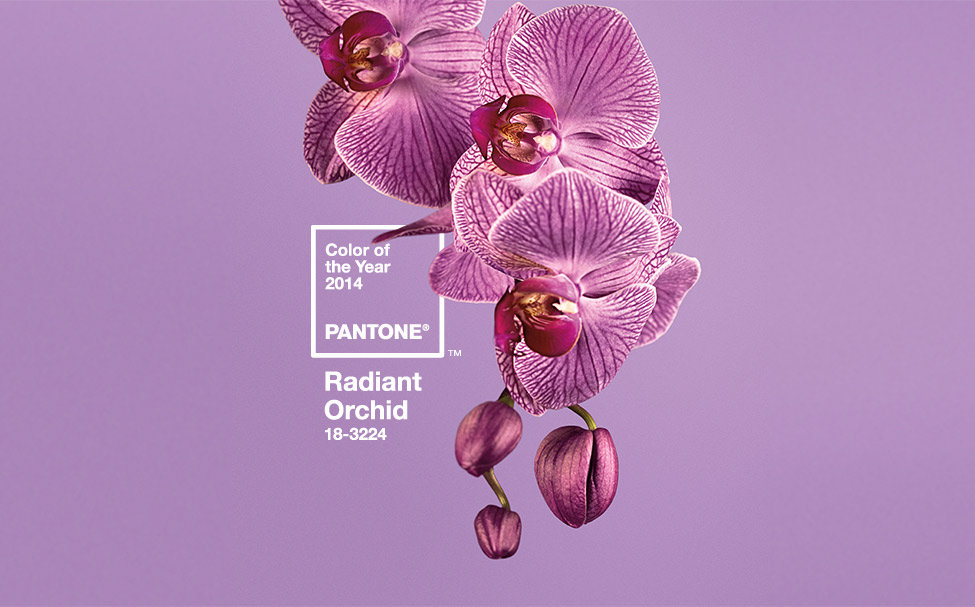
Pantone’s “Radiant Orchid”

Pantone has chosen Radiant Orchid as its reigning hue for 2014. It’s a “captivating, magical, enigmatic purple,” according to Leatrice Eiseman, executive director of the Pantone Color Institute. It’s an innovative color that “encourages expanded creativity and originality, which is increasingly valued in today’s society.”
Radiant Orchid is a lovely, fresh combination of fuchsia and purple with subtle pink undertones. Eiseman feels that the color “inspires confidence and emanates great joy, love and health”—a positive antidote to today’s strife-filled world.

And it’s an unexpectedly versatile color. Because it combines cool blue and warm red tones, it’s flattering to almost everyone. Its rosy hue radiates on the skin, giving both men and women a healthy glow. Perhaps that’s why it was so popular on the runways during the Spring 2014 fashion shows. And we’ll be seeing more of this energetic hue in our favorite designers’ Spring collections.
Fashion-wise, Radiant Orchid pairs beautifully with similar shades of lavender, pink and purple. It enlivens neutral tones such as gray, beige and taupe. It complements olive and hunter greens—even light chartreuse. And its rich regal color pops when combined with turquoise, teal and light yellow, its color wheel opposite.
Sherwin-Williams’ “Exclusive Plum”

Sherwin-Williams’ recent choice for Color of the Year 2014, Exclusive Plum, is similar yet different. The paint company’s director of color marketing, Jackie Jordan, chose Exclusive Plum for its “mystical” and “experimental” qualities that hint of alchemists conjuring up their elixirs and brews.
Unlike Pantone’s Radiant Orchid with its pink undertones, Sherwin-Williams sought to steer clear of overly pink tones. Some purples are “tricky to work with,” says Jordan, as they can appear “too bright, too garish.” She feels that the shadowy Exclusive Plum is a sophisticated, practical purple that’s rich yet still “easy to live with.”
Exclusive Plum pairs nicely with orange, chartreuse or magenta, hues that amp up its energy. Just as Radiant Orchid complements lighter yellows, the deeper Exclusive Plum combines beautifully with deeper, gold-toned yellows. The color energizes neutral, warm earth tones. And it freshens whites and greys, lending them a softer, lighter-in-spirit feel.